The New User Interface is Here
about 3 years ago
sxqBtp
Hello everyone!
🎉 The new user interface is here! 🎉
After months of designing, testing, tweaking, and fine-tuning, the new KARDS user interface is now live for all players. Read on for more details about the new user interface.
We’ve also prepared a short video overview of what you can expect with the new user interface:
We’d love to hear your feedback on the new UI! Please head into the NUI Feedback channel on the official KARDS Discord server to leave any thoughts, comments or suggestions you have on the new UI.
New User Interface: Overview
From our own insight, community feedback, and the ambition to run KARDS for many years to come, we’ve seen that the KARDS user interface could be improved. In developing the mobile version of the game, we saw an opportunity to overhaul the user interface, to streamline it and improve the overall user experience. The new user interface will be available on both the PC and mobile version of the game, so players will have a consistent experience regardless of which device they are playing on. Here, you can find an overview of all the changes you can now experience in your game.
KARDS Home Screen
The KARDS home screen is changing fundamentally with the new UI. The KARDS Home Screen has a new look, allowing for increased flexibility and for us to communicate better about all the exciting things going on in and around KARDS.
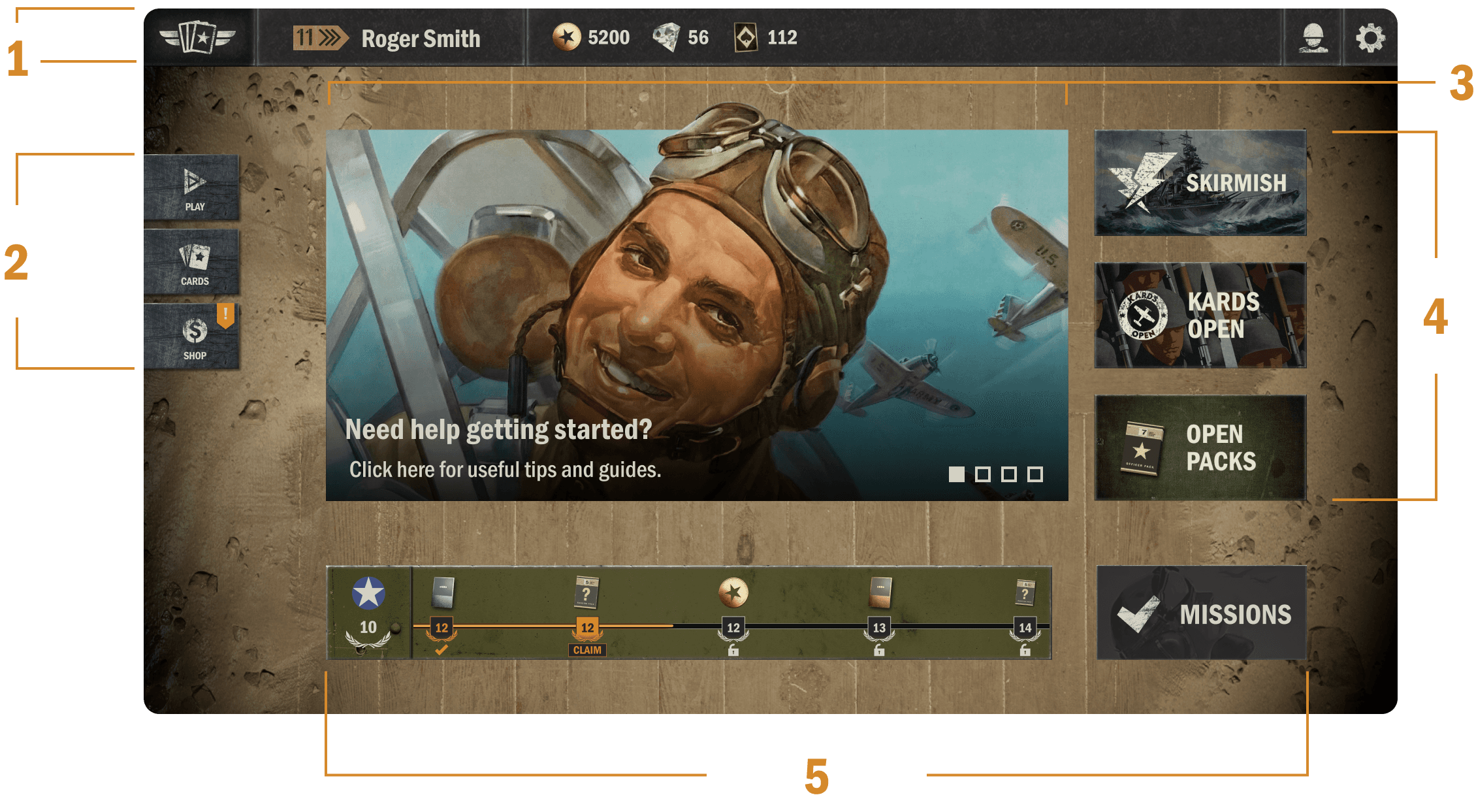
1. The Top Bar
On the far left, you’ll find the Home button. Simply click on the KARDS logo to take you back to the home screen from almost any other part of the UI.
Next is the button to your profile - indicated by your current rank and player name.
Then, the resource overview - the amount of gold, diamonds and wildcards you have.
Finally, on the far right, you have the Friends and Settings buttons.
2. The Main Menu
PLAY navigates to Battle, Training, Campaigns, or any other game mode. More on this below
CARDS gets you to your decks, deck builder and card collection. More on this below.
SHOP takes you to the shop.
3. Content Carousel
The content carousel is a rotating banner on the home screen that keeps you updated on all the latest things in KARDS. This can be information about a recent expansion, decklists, guides, dev blogs, news, store offers, tournament info, etc.
4. The Right Side Buttons
The buttons on the right side will vary depending on the content we want to highlight or feature at any given time. They will mostly be reserved for shortcuts to specific events or game modes, such as Skirmishes.
5. The Progress Line
On the bottom of the new UI you will find your national progress - the UI will by default show you the last main nation you progressed in, but you can also switch to a different nation. Your missions are accessible in a separate button next to the progress line.
PLAY Button
The Play button determines how you enter any given game mode.
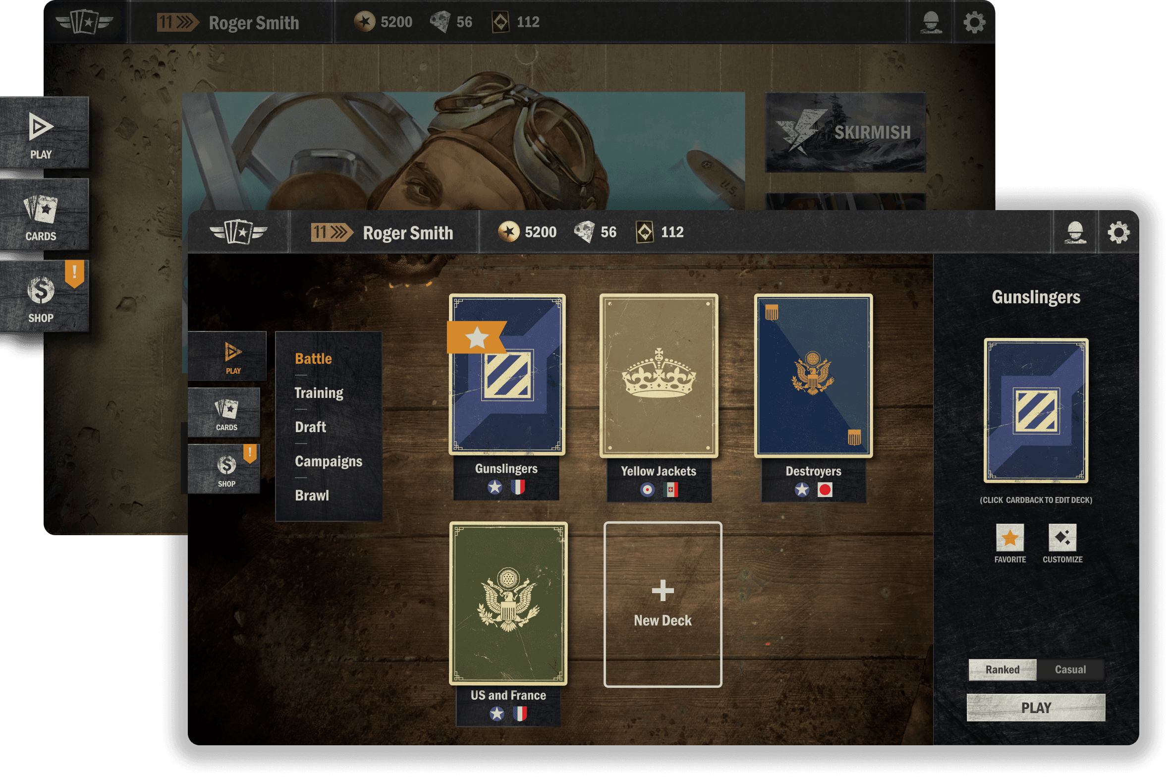
Under the Play options, you’ll be able to select any of the game modes available at the time:
Battle (PvP) - with a toggle between Ranked or Casual
Training (PvE)
Draft
Campaigns - starter campaigns or Theaters of War
Battle Code
Skirmish - when available
Select Deck
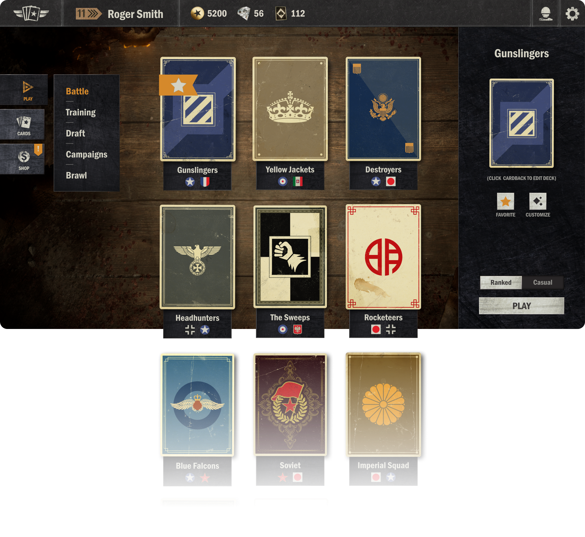
After picking a game mode to enter, you’ll be prompted to select a deck from your library to play with. Scroll up and down to browse your list of decks. Decks will be ordered by usage (last played, last created, etc.).
On the right hand side, you’ll see the selected deck and interact with it through the buttons provided. Customize the deck (swap card-back, board items or emotes), or hit the star button to favorite the deck, so it’ll always show up at the top of the deck list.
Below the selected deck you’ll be able to toggle between ranked or casual mode, and, finally, hit the play button to head into the game!
CARDS Button
The CARDS button on the main menu allows you to explore your decks and collection of cards.
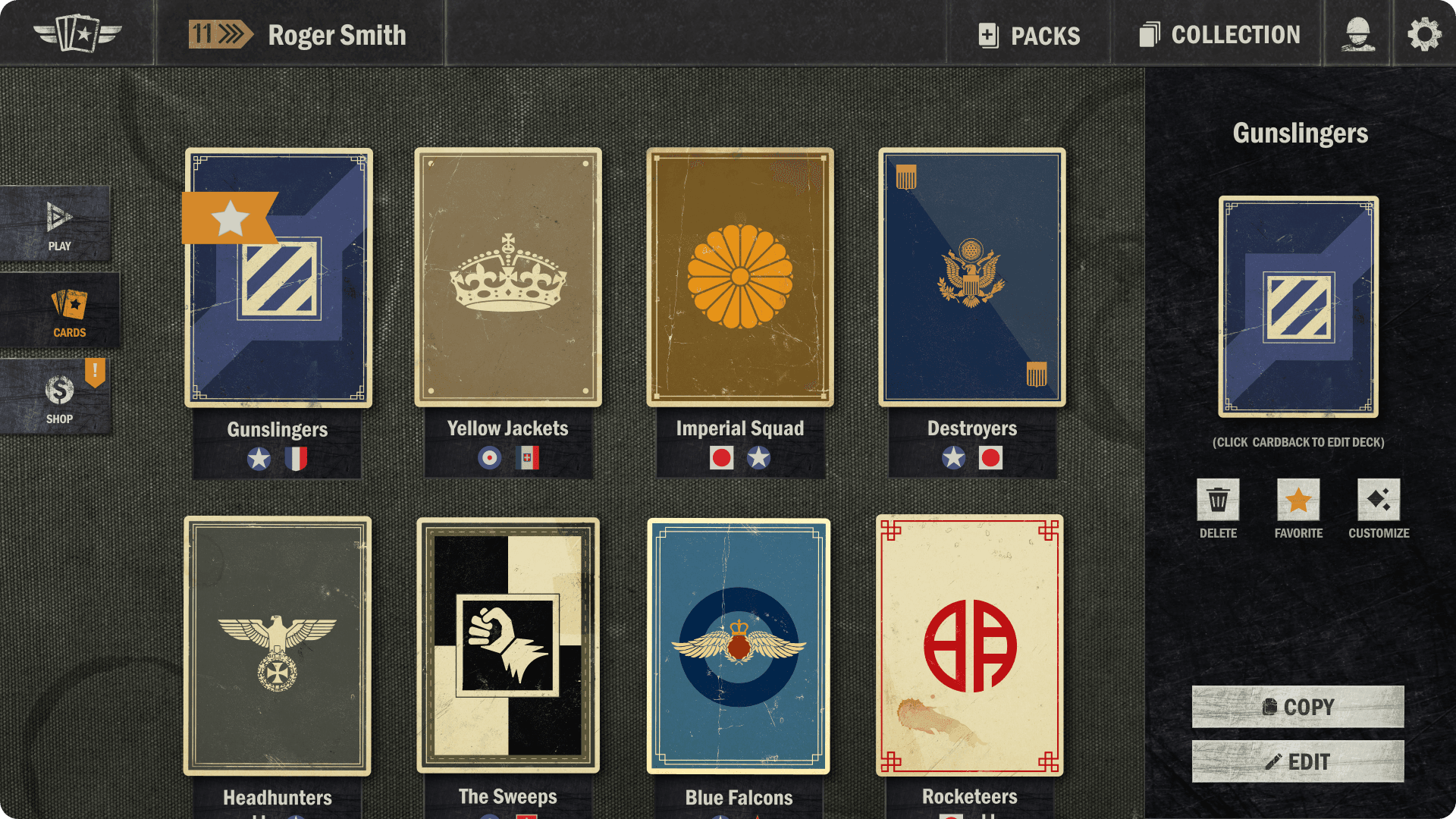
Click the PACKS button on the Top Bar to open your unopened packs.
Click the COLLECTION button on the Top Bar to access your card collection.
Browse through your library of decks by scrolling up and down.
Click the empty deck slot to create a new deck.
Click any of your existing decks to bring up details about the deck and edit it.
On the right hand side, use the buttons provided to delete the selected deck, mark it as a favorite, customize the deck elements, copy the deck code to your clipboard or edit the deck.
Deck Builder
The layout of the deck builder has changed quite significantly. These changes are done with consideration of a lot of community feedback we’ve received throughout the years. The goal with the new deck builder is to improve accessibility, provide an improved deck overview, have a consistent and clear UI for the upcoming mobile version of the game, as well as introducing various improvements for power users (especially on desktop). The new deck builder is split into three main areas:
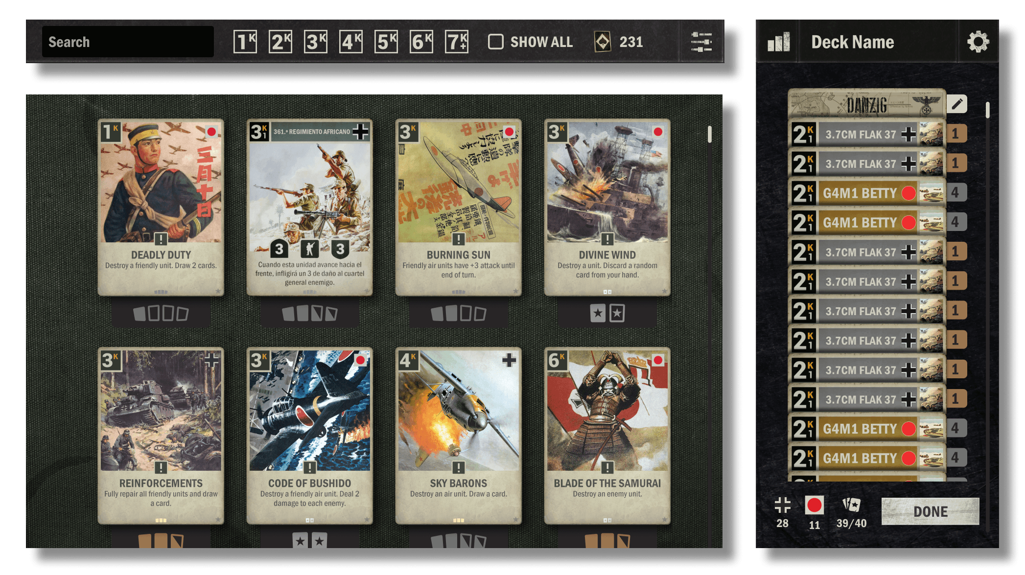
The Top Bar, with a search bar, a “show all” button to include unowned cards, a wildcard overview, and a button to access filters.
The Card Collection, filtered by the nations in the deck. Scroll up and down to view all the cards. Right-click a card for more details and the ability to create a card with wildcards.
The Deck Overview is visible in its own panel on the right side. On the top of the deck overview, you can access details about your deck composition and change the name of the deck. Within the deck itself, using the edit button next to the top two cards, you can change the card-back and edit your HQ/battlefield. On the bottom you have an overview of the number of cards from each nation in the deck, the overall number of cards in the deck, as well as the “Done” button for when you’re finished editing.
Still to Come
The changes we’ve introduced so far to the user interface are quite significant, but we still have a few additional things ahead in the interface!
Still up ahead you can expect some changes to the battle scene and the shop. We’ll be overhauling the keyword and ability icon system to, among other things, give players clearer visual feedback on what is happening on the board and to function better on mobile devices. We’ll also be improving the battle history to enhance its readability. Finally, the Kredit overview UI is receiving improvements as well. We’ll communicate more details about the upcoming changes as we get closer to their releases.
We’d also like to note that, as we move forward, we may still tweak and fine tune some elements of the new user interface.
Let Us Know What You Think!
We’d love to hear what you think about the new user interface! Please join us in the New Interface Facility in the official KARDS Discord server and let us know any thoughts, suggestions or other feedback you have on the new user interface in the NUI Feedback channel.
You can also report any bugs you run into with the new UI in the NUI Bug Reports channel, get assistance with the new UI in the NUI Help channel, and engage in general discussions with other players about the new UI in the NUI Discussion channel.
We look forward to hearing your thoughts on the new UI!
